Nike.com
in partnership with STYLITICS
Designing digital retail experiences for one of the world’s biggest brands.
Discoverability
20% Increase
Overall visibility
Resources
50% Drop
Dev time to market
Clients / Verticals
+3 Markets
Solution viability
Overview
Opportunities
& Impacts:
Stylitics’ most effective offering is a set of white-label modules that directly integrate into an existing client experience. It clearly showcases outfits, rooms, and other collections of related items dynamically, powered by ML and clustering with logic-defined performance and relationship data, complimentary data directly from the retailer, and / or associations curated by Stylitics' in-house stylists.
Contextual variations of these collections are then integrated all over client's sites and apps, and (chances are) you have probably seen them on product pages (being used to boost conversions, increasing basket size and upselling complementary items).
The existing designs lacked adaptability to our clients' varied UIs.
Some client components do not align with UX best practices and failed ongoing user testing.
Custom development was frequently required to meet client integration needs (specifically ‘look and feel’).
Custom builds and integrations continually diverted developers and designers from focusing on the product roadmap and future-oriented concepts (including consolidation of the product offering).

STYLITICS’
Modules
Product Page
Shop-the-look Module
Outfit Drawer
Testing the experiences
We identified multiple retailers that were actively using heavily customized integrations of Stylitics’ offering, giving the team a testable baseline for both user testing and performance data. Multiple waves of tests were conducted using Usertesting.com to identify usability risks and opportunities, and assess user sentiment (both positive and negative).
"Performance data from clients gave us a head start."
Participants per
Test Group
60
Demographics
All genders,
35-65+
Income
$20k-$80k+
Method
User interviews

Key Takeaways
Although there was a combination of affordances on the widget, users weren’t finding the horizontal scroll.
When users clicked into the outfits they were confused to the layout and wanted a way to look at the items first.
Users felt overwhelmed with looking at all the details instead of being able to just get a better look at what the outfit was.
Mobile Discovery
Desktop Discovery
Key Takeaways
Users expected different experiences after finding and clicking on the “shop the look” CTA.
The overlay required users to scroll within the widget and didn’t take advantage of the desktop real estate.
Interaction with multiple outfits required more user effort and led to user navigating away from the experience.
Creating a UI tool kit
The need to establish a default visual language for the widget became clearer after testing. The goal was to standardize an experience to function across all devices / breakpoints, and be adaptable on all of our customer's UI platforms and frameworks.
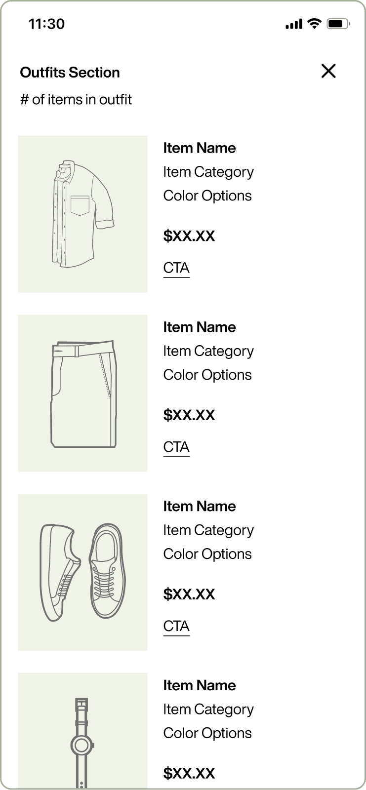
View more button - opens modal or drawer to view items within an outfit
Extended button - extends when hovering on an outfit on desktop.
Text button - developed to fit broader clients’ design language
Item label - appears when hovering over an outfit while on desktop
Pagination tab - used within modal on desktop to browse outfits
Pagination pill - affordance to show outfit # and total # of outfits
Establishing guidelines
Understanding that most clients will tweak sizing and padding, we wanted to focus on interactions when creating our guidelines. Additionally, a few users were scrolling past our modules, and we wanted to increase affordances to better mitigate that scenario. We also launched two off-the-shelf versions of the shelf for mobile, to feel native across as many client experiences as possible.
Revised Module
Outfit Drawer
Outfit Takeover
GUIDELINES
Don’t make users guess how many items are left within a carousel.
When “peeking” in a carousel, add a background to increase affordance for multiple items.
Follow user’s mental models when interacting between an outfit and what they view after clicking into the outfit.
Include how many items are within an outfit if there are more than 4 items.
Use a full takeover instead of a drawer when the global navigation cannot be locked or fully overlayed.
Applying guidelines to mobile
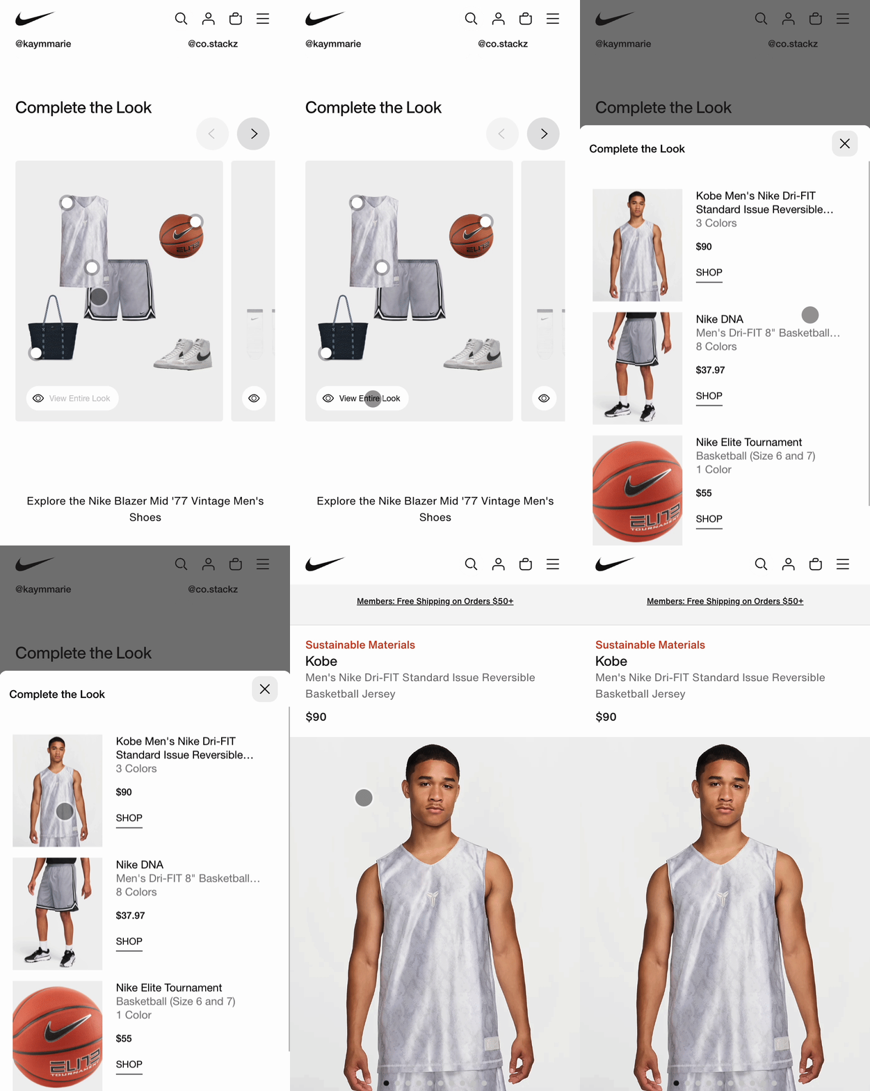
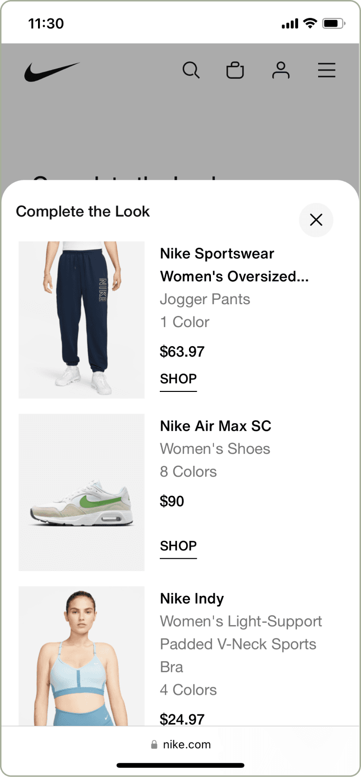
With the new guidelines set in place, we partnered with Nike and worked with their design team to unify our guidelines with their design language.
Stylitics Module
Outfit Drawer
Adapting guidelines to desktop
Nike’s experience required an adaptive approach, rather than a responsive design. The modal experience allowed for a better interaction between outfits and provided space to iterate on future features that the team was already developing.
GUIDELINES
Don’t make users guess how many items are left within a carousel.
When using “peeking” in a carousel, add a background to increase the affordance of multiple items.
Follow user’s mental models when interacting between an outfit and what they view after clicking into the outfit.
Include how many items are within an outfit if there are more than 4 items.
Use a full takeover instead of a drawer when the global navigation cannot be locked or fully overlayed.
Results on Desktop
Discoverability
20% Increase
Overall visibility
Resources
50% Drop
Dev time to market
Clients / Verticals
+3 Markets
Solution viability
The updated guidelines were used to sign new clients to Stylitics that had initially passed.
Nike was able to show direct correlation to increased conversion and basket size.
Improved the overall discoverability for the module and additional products was seen after release.
Onboarding and set up of the modules decreased down to about 1 week.
Ready? Let’s go!
With all the intel and background, it’s time to see the experience in action.
Role / Company
Head of UX & Product Design, Stylitics
Year
2021


